Do you want to improve accessibility on your WordPress site?
When building a website, accessibility often gets neglected, which can create a poor user experience (UX). Ideally, you want your WordPress site to be user-friendly and inclusive to all individuals, regardless of their needs.
In this article, we will show you how to improve the accessibility of your WordPress website.
Why Is Accessibility Important for My WordPress Site?
In web design, accessibility refers to techniques used to make a website easier to use for people with disabilities. Some visitors use assistive technologies to navigate the web, like screen readers for people with visual impairments and keyboard navigation for folks who cannot use a mouse.
There are some common best practices that are recommended by experts to make websites more accessible. They help make sites more inclusive and user-friendly for everyone, regardless of ability.
By prioritizing accessibility, more people will be able to navigate your WordPress website and explore your content. If you run an online store, then you will also increase your chances of converting users into customers.
Accessibility is also important for search engine optimization (SEO). Google values websites with good user-friendliness. Besides making your website more responsive for mobile devices, you can also prioritize inclusivity in your web design to improve rankings.
Additionally, if you are a business website owner and the front end of your site is inaccessible, then you could face legal consequences.
The Americans with Disabilities Act (ADA) states that consumers can file a complaint if a site does not comply with accessibility guidelines. What’s more, your reputation could get ruined, which could result in financial losses.
How Does WordPress Make My Website More Accessible?
WordPress has several built-in functionalities to help users make their WordPress websites accessible. For example, by default, you can add alternative text (alt text) and title attributes to images so that screen readers can read them out loud for users with visual impairments.
WordPress has also made it mandatory for all new and updated code in WordPress to follow its accessibility coding standards. This is to ensure WordPress developers comply with best practices for accessibility when creating themes and plugins.
Other than that, WordPress includes features that make it easy for users with disabilities to build their own websites, like the accessibility mode for adding widgets.
For more information, we recommend keeping up with the Accessibility tag on the Make WordPress Core page for more information.
With all this in mind, WordPress is not entirely accessible out of the box. As a website owner, it’s important to take extra steps to help your site meet accessibility standards.
We have broken down this guide into a few easy tips to improve your WordPress website’s accessibility. You can use these quick links to navigate to a specific section:
1. Get Familiar With the Web Content Accessibility Guidelines (WCAG)
First things first, we recommend reading the Web Content Accessibility Guidelines (WCAG). These are the standards laid out by the W3C Web Accessibility Initiative (WAI) for users to make their websites more accessible.
You can check out the WCAG 2.1 and WCAG 2.2 updates for starters. If both documents seem too long to read, then feel free to bookmark this quick reference instead.
2. Use an Accessibility-Ready WordPress Theme
Accessibility-ready themes have met the minimum accessibility standards that the WordPress theme review team has set.
Using an accessible WordPress theme does not mean your website will automatically comply with all accessibility requirements, as you still have to make some tweaks on your own. However, it can give you a jumpstart to making your website more accessible.
At the very least, an accessibility-ready theme will have:
- Menus that can be navigated using the keyboard alone.
- Good color contrast that makes the content readable for users with visual impairments.
- Semantically correct HTML, which helps assistive technologies understand the content and structure of a web page.
If you want to take things a step further, you may also want to check if the theme has ARIA attributes in it. These attributes are like extra information that complements your theme’s HTML to make a website even easier to navigate for assistive technologies.
The easiest way to look for an accessibility-ready theme is by going to Appearance » Themes on your WordPress dashboard. Then, click ‘Add New Theme.’
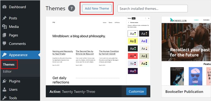
From here, select ‘Feature Filter’ and choose ‘Accessibility Ready.’
Feel free to add more filters to find the theme that matches your exact needs.

Now, scroll down and click ‘Apply Filters.’
You will then see some accessibility-ready themes on the screen.

For more theme recommendations, check out our expert picks of the best WordPress themes.
3. Install a WordPress Accessibility Plugin
A WordPress accessibility plugin adds helpful features for visitors with disabilities to navigate your website.
One WordPress accessibility plugin we recommend is WP Accessibility. Some of the things this plugin can do include:
- Adding an accessibility toolbar
- Detecting whether your theme is accessibility-ready
- Tracking how the accessibility features on your website are being used so that you can assess them
First, you need to install and activate the plugin on WordPress.
Upon activation, you need to go to Settings » WP Accessibility to configure the plugin.

Let’s take a look at each section of the settings page.
Add Skip Links
In the first section of the plugin settings, you can use skip links on your website, and this setting is enabled by default. A skip link allows users to jump directly to the content section of a post or page.
This is an extremely useful feature for people using screen readers. Without a skip link, they will have to listen to everything displayed on your website, including your navigation menus, before they reach the content part.
If your theme already uses skip links, then you will see a notification confirming that.

Accessibility Toolbar
The WP Accessibility plugin comes with an accessibility toolbar.
When you enable it, the plugin will add a toolbar on your website where users can resize fonts or view your site in high-contrast color mode.
This lets your users select the options they need to make the page easier to read.

To enable the toolbar, simply check the ‘Font size’ and ‘Contrast’ checkboxes.
There are also settings where you can control the toolbar’s font size and placement.

If you make changes to these settings, then make sure you click the ‘Update Toolbar Settings’ button to store your settings.
This is what the toolbar looks like on our test website.

Accessibility Fixes
WP Accessibility also provides several accessibility fixes that could solve potential issues on your site. You can go through each option and see if you need it.
Some recommended settings will be checked by default. These options prevent links from opening in new windows, display an error when you submit an empty search submission, and remove the tabindex HTML attribute where it is not needed to simplify keyboard navigation.
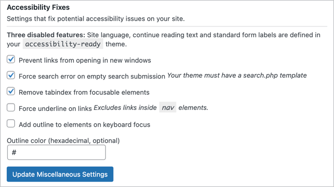
If you are using an accessibility-friendly theme that has already enabled some of these features, then you will see a message confirming this at the top of the section.
Don’t forget to click the ‘Update Miscellaneous Settings’ button to store your changes.
Accessibility Features
The plugin also provides a few options to help make your content more accessible.
The first group of settings makes images easier to handle for those using screen readers.
There are also options to display summaries at the top of your posts and pages. This allows those with screen readers to hear a summary of the content before deciding to listen to the entire article.

If you change any of these options, then please remember to click the ‘Update Accessibility Features’ button.
Testing & Admin Experience
Next, you will find some settings that let you improve the accessibility of your WordPress admin area and help with testing.
This section is more technical, so make sure you consult the plugin’s documentation before checking the boxes.

Make sure you click the ‘Update Accessibility Tools’ button to save your changes.
Remove Title Attributes
This section lets you remove the title attribute from tag clouds.
The title attribute is considered to be useless by some accessibility experts. Most screen readers usually ignore the title attribute and instead read the anchor text.

This setting is enabled by default, but if you change it, then make sure you click the ‘Update Title Attributes Settings’ button.
4. Check Your Website’s Color Contrast
Color contrast means the difference between the text color and background color. It’s a very important part of website accessibility because it can affect how readable your website content is for people with poor vision and color blindness.
To meet web accessibility standards, regular text should have a high contrast of at least 4.5 to 1. This means the text needs to be 4.5 times brighter than the background.
For larger text, the requirement is a bit less, at 3 to 1. This means a slightly lower contrast is acceptable. The same rule applies to graphics and user interface elements, such as form input borders.
The WP Accessibility plugin has a built-in color contrast checker that you can use.
In the plugin settings, simply scroll down to the Color Contrast Tester section and choose a foreground color (the color you will use for your text) and its background color.
Then, click ‘Check Color Contrast.’

The plugin will then tell you if the colors pass or do not pass the contrast test.
Here’s what the result looks like:

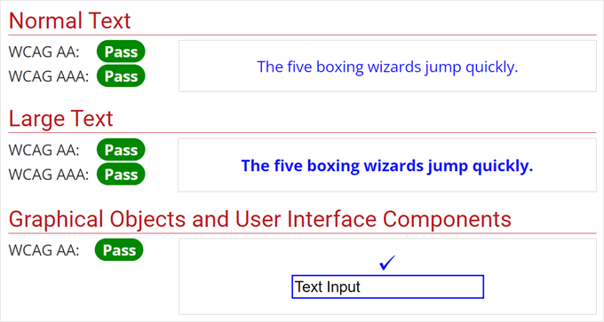
Alternatively, you can use the free WebAIM Contrast Checker. As with the previous tool, you will only need to select a foreground color and a background color.
This tool not only tests your color contrast but also shows you what the colors may look like as normal and large text, as well as graphical objects and user interface components.
For more details, you may like to see our guide on how to pick the perfect color scheme for your WordPress website.
5. Add Alternative Text to Images
Besides being useful for search engines, alt text is helpful for screen readers to describe images to individuals with visual impairments.
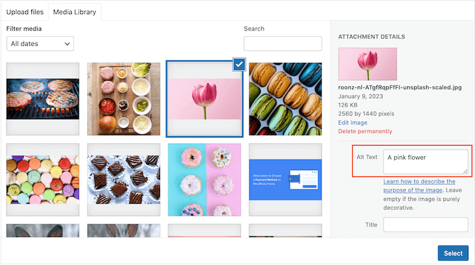
Previously, we mentioned that WordPress has a built-in feature for adding alt text. The process is pretty easy, and you can read all about setting it up in the following guides:
Expert Tip: If you want to automatically set a consistent alt text format for all of your images, then you can use All in One SEO’s Image SEO tool.
6. Add Labels to All Form Fields
If you have forms on your website, then you will want to make sure that you use the appropriate labels for each form element. This includes form fields, buttons, menus, and so on.

The WCAG recommends adding labels to all form elements to make it easier for assistive tools to identify and relay information about each one to users.
Furthermore, adding clear and descriptive labels is a good web design practice. By helping users understand what each form field is for, user errors are less likely to occur, and more people will be able to submit their forms.
If you are not sure how to create great forms, then we recommend checking out WPForms. It’s the best WordPress form builder that makes it super easy to customize forms to your exact needs, including improving them for accessibility.

You can read more about WPForms in our WPForms review. Also, check out these guides on how to create forms in WordPress:
7. Use Proper Heading Tags in Your Content
Heading tags are HTML tags that can mark the titles or subtitles of a web page. This way, your content is much more organized and easier to follow.
These tags also help tools like screen readers generate a navigable outline for users with visual impairments. This will allow them to jump between sections and understand your content’s overall structure.
If you are not sure how to take advantage of heading tags, then you can read our guide on how to properly use heading tags in WordPress.
8. Use Descriptive Anchor Text
Anchor or link text is basically the clickable words or phrases in a link. You can usually tell which text is linked because it will be in a different color.
Often, bloggers will use the link text ‘click here’ or ‘read more’ to direct visitors to a page.
This is not a good practice for accessibility because it doesn’t give any information about where the link goes. This makes it hard for people using assistive technologies to understand the purpose of the link.
That’s why it’s best to use descriptive anchor text instead. This means using words that describe what the content is about when you click the link.
For example, let’s say that you want to add a link to an article about the best WordPress hosting in this sentence: ‘Follow this guide to learn about the best WordPress hosting services on the market.’
Instead of adding the link to ‘Follow this guide’ or anywhere else in that sentence, you should insert it into ‘best WordPress hosting services.’ This way, the user gets an overview of what they will find in the linked content
For more information about links and anchor text, see our beginner’s guide on linking in WordPress.
9. Add Captions or Transcripts to Video and Audio Content
One of the main struggles for users with hearing disabilities is the inability to understand spoken content in videos and audio. That’s why a lot of video content creators and podcasters add captions or transcripts.
At WPBeginner, we strongly discourage you from uploading videos to your own website because they can slow your site down. Instead, it’s best to use services like YouTube or Vimeo, both of which have built-in tools for adding captions.
As for audio content, you may want to consider using a transcription service to convert speech to text easily. This way, you won’t need to manually create a written version of your audio content.
Check out our list of the best transcription services for more information.
10. Do Usability and Accessibility Testing
If you have implemented all the tips from this guide, then the final step is to do usability and accessibility testing on your WordPress website.
This testing can help you identify any remaining issues and help you make your website user-friendly and accessible to everyone.
WebAIM has a Web Accessibility Evaluation Tool (WAVE) that you can use for free.
Simply type in your website’s domain name, and the tool will identify any accessibility-related issues for you.

You can also use an accessibility scanner. We recommend checking out Accessibility Checker by Equalize Digital. It also comes with a free plugin version to scan unlimited posts and pages on your website.
After installing the plugin, you can simply go to the block editor of your page or post. If you scroll down to the meta box section, you will find an Accessibility Checker that identifies your accessibility issues.

Another option is to perform a UX audit, which basically means checking your website to see if it has a good user experience. Just head over to our UX audit guide for more information.
Last but not least, we encourage you to ask for your user feedback. While testing can get you results, getting feedback from actual visitors who use your site’s accessibility features can provide much more accurate insights.
UserFeedback is the best plugin for this job. It lets you create surveys to collect your users’ opinions and thoughts. There are also templates for website design feedback, so you won’t have to create the survey from scratch.

For more information, just see our guide on how to get website design feedback in WordPress.
Expert Guides on WordPress Accessibility
Now that you know how to improve accessibility on your site, you may like to see some other guides related to WordPress accessibility issues:
If you liked this article, then please subscribe to our YouTube Channel for WordPress video tutorials. You can also find us on Twitter and Facebook.


